
What Colors and Materials Sell Best in a Flip?
There’s no single color or material that works everywhere, but there is a pattern in what buyers consistently perceive as expensive.
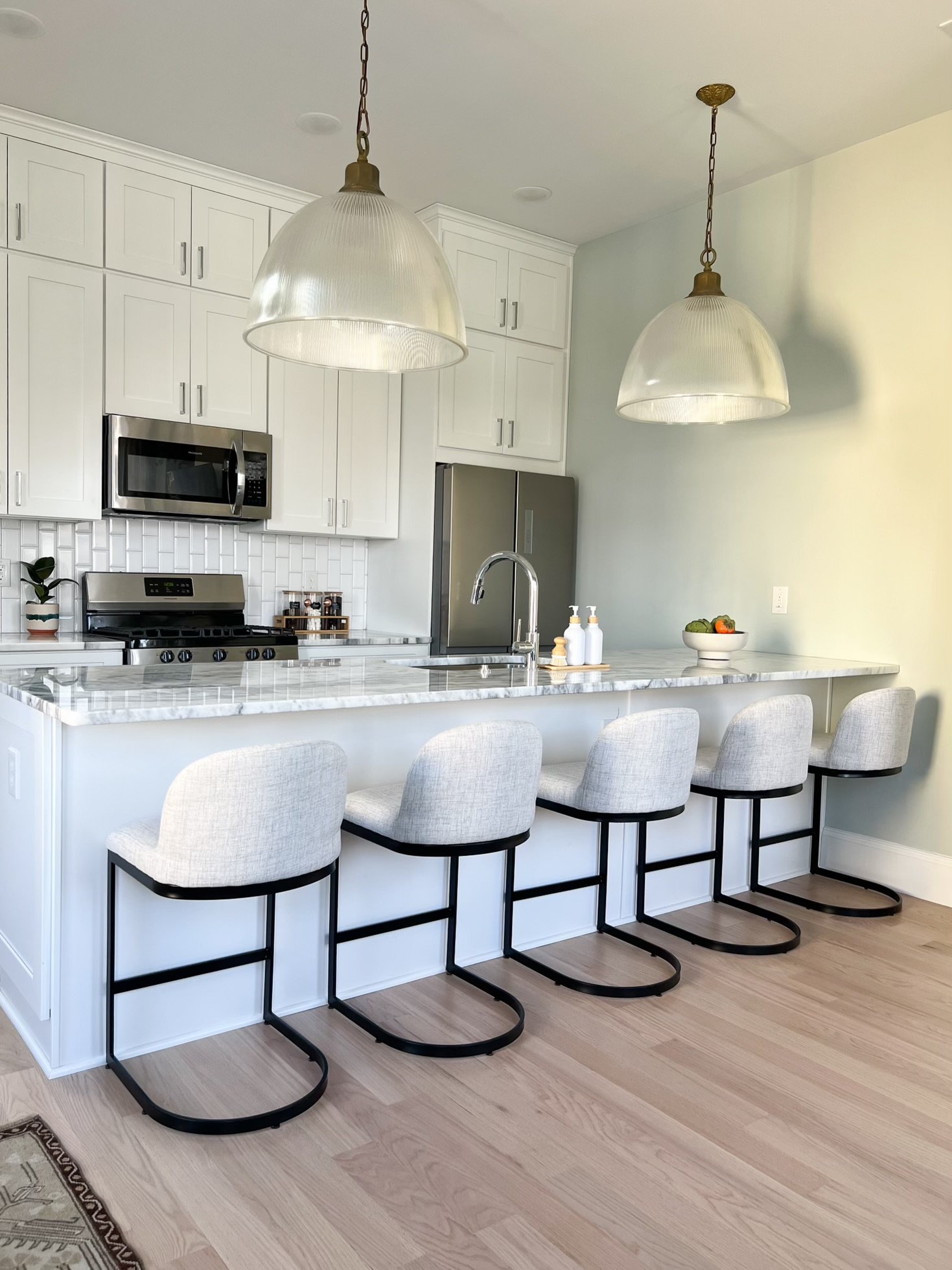
When people walk into a house that feels like it belongs in a home magazine, their guard drops. The assumption is immediate: this house is elevated, well done, and worth more.
That’s not about playing it safe. It’s about choosing colors and materials buyers already associate with high-end homes because they’ve seen them over and over again in magazines, listings, and design features.
That’s why when people ask me questions like, “Should I run tile or wood floors in the kitchen?” my answer is always the same:
Go look at the magazines. What do you see there?
If buyers recognize those same choices in a house they’re touring, they don’t stop to question them - they just accept them as “the right choice.” This matters because perception drives price. If a home feels magazine-worthy, it automatically reads as more expensive, more finished, and more desirable.
We don’t avoid color. We use it intentionally (the same way editorial designers do) to create that elevated, familiar feeling that makes buyers comfortable paying more.
The goal isn’t to be trendy. It’s to look like you belong on the pages buyers already trust